Designing with AI: How Technology is Transforming the Industry
The world of design is undergoing a radical transformation thanks to the rise of Artificial Intelligence (AI). From graphic design and web design to industrial design and architecture, AI is being used in a variety of ways to improve the efficiency, effectiveness, and creativity of the design process. In this blog post, we’ll explore some of the ways in which AI is changing the design industry, and how designers and design firms are leveraging this technology to stay ahead of the curve.
Image Generation
Anyone should easily see that AI is inevitable now. In August this year, someone used Midjourney, a program that generates art, to win a digital art competition (New York Times). The panic that follows is that artificial intelligence programs like Midjourney, Stable Diffusion, and DALL-E 2 will ultimately replace artists and designers. In this post, let us test its performance using some of the projects in the Foundations of Graphic Design. The model I opted for is the famous DALL-E 2 developed by OpenAI. I do this by providing a detailed sentence acting as a brief, and the DALL-E will generate a few images as a response.
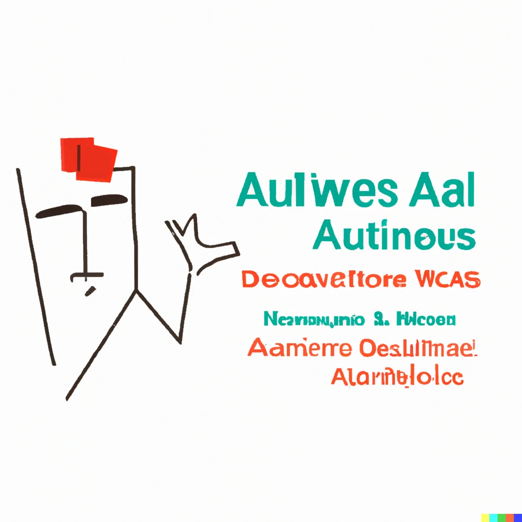
Challenge 1 Design a logo for That’s My Job
First let us test the capabilities of the model using a rather simple poster design. For those who do not know, That’s My Job is a car washing business ran by people with disabilities in the future center of rehabilitation located in Abu Dhabi, UAE. I say it’s simple because there is tons of car washing logo out there in the web — so it is easy for the model to learn something that has been repeatedly done by us humans. The obvious downside of this is that the human designs out there are in the “banana zone” — a term used to describe a desgin as a “no-brainer” by Goffredo. Unsurprisingly, DALL-E 2 gave me a few of the most cliche logos I could find. I tried variations of the “brief”, but it generally follows this:
Design a logo for That’s My Job, a [professional and cheap] car washing business [with employees of disabilities] [in Abu Dhabi]
The text in brackets is optional, allowing the generated design to have different focus.
| Everything Added | Focus on disabilities | Focus on Abu Dhabi |
|---|---|---|
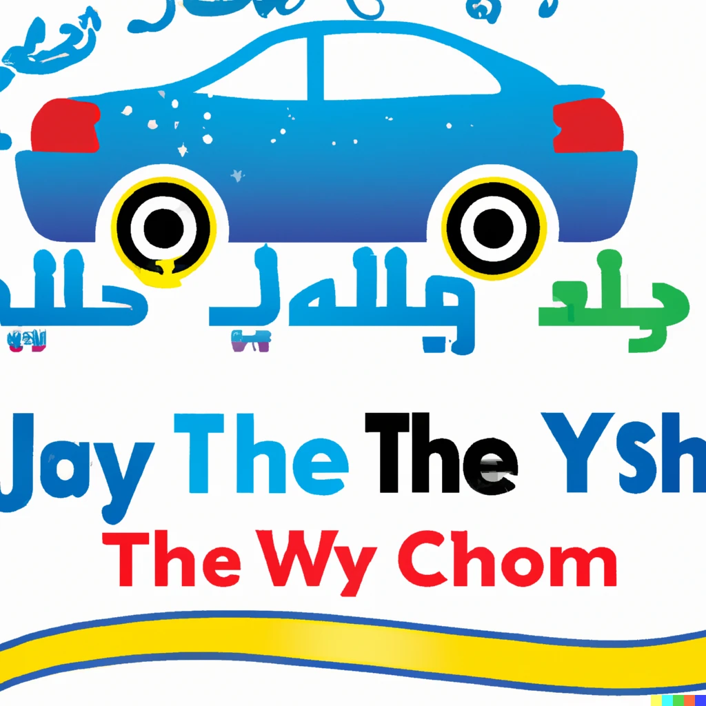 | 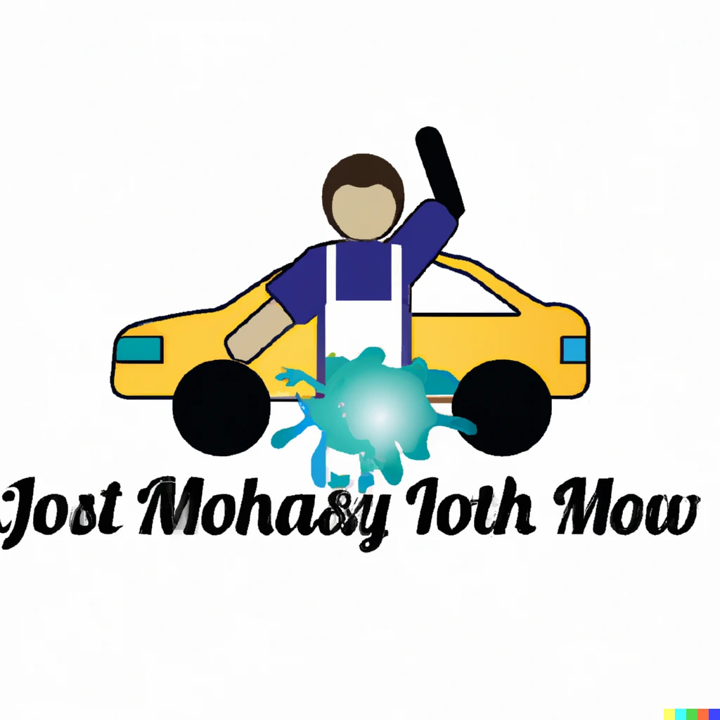 | 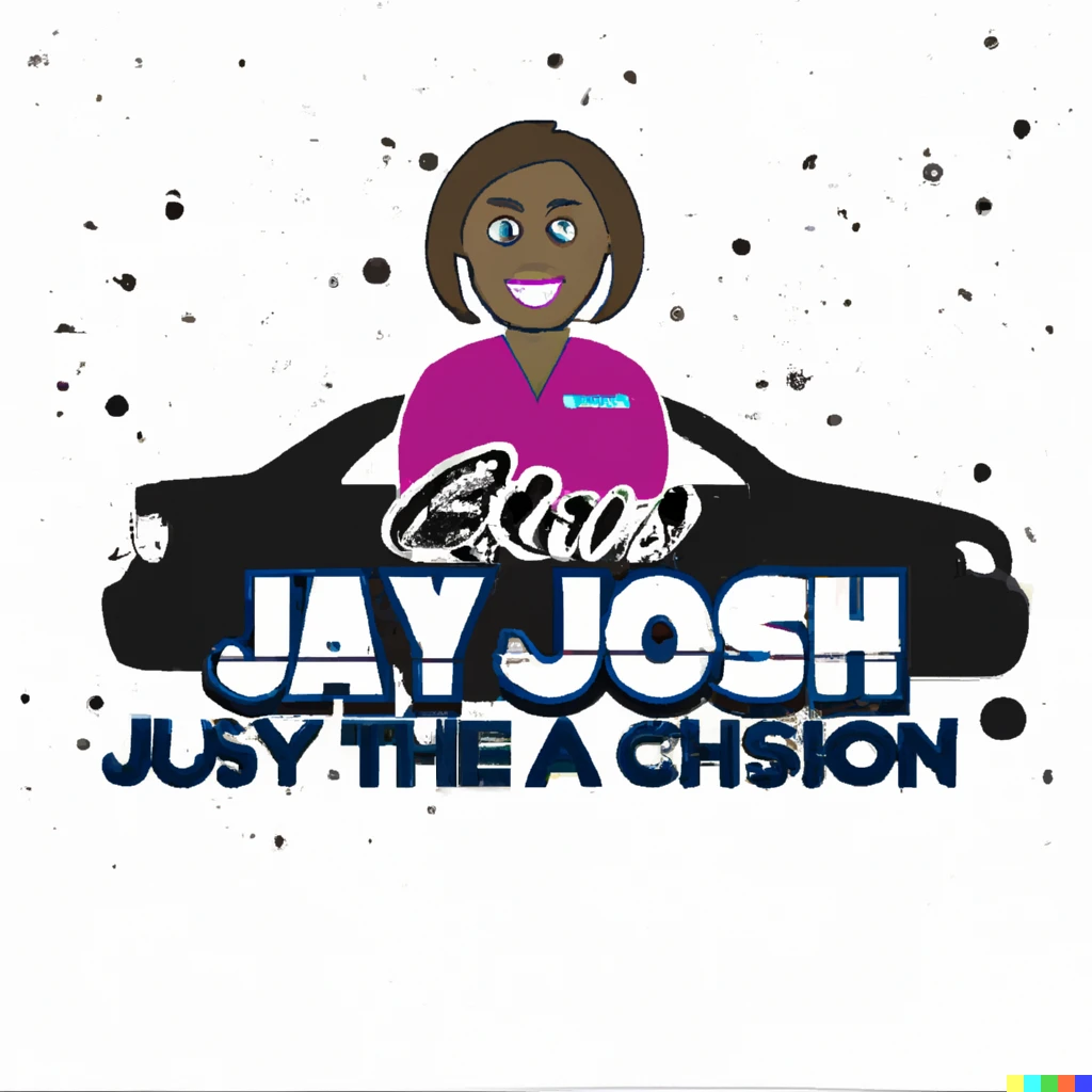 |
At this point, we easily know that DALL-E 2 would fail Goffredo’s class spectacularly by giving out such stereotypical and disrespecting designs. But that’s a rather high standard, for artificial intelligence. We could see that it understood the focus of the brief — a car-washing business — correctly, and was able to add its interpretation according to the focus. For example, the first picture included Arabic — even though it’s presumably incorrect; the person’s arms in the second logo have different colors, which may correlate to the “employees with disabilities” in the brief; in the third logo, the person is dark-skinned, as opposed to the second logo, meaning that the logo was able to capture “Abu Dhabi” and change the element in the logo correspondingly (though highly stereotypically).
Challenge 2 Al-Ruwais Logo Design
Now let us up the difficulty: designing a logo for arts center is arguably harder than a logo for a car-washing business. The former has fewer data out there to generate similar designs. However, the logos for arts centers are generally better than the logos for car-washing businesses. Again, for those who don’t know, an alumni is eastablishing a community arts center in Al-Ruwais that serves the local community, which is largely comprised of migrant workers. For this challenge, I used the following two prompts
- Design a logo for Al-Ruwais Arts Center, an art center for the workers in the Al-Ruwais region in Abu Dhabi, United Arab Emirates
- Design a logo for Al-Ruwais Arts Center, an arts center in Abu Dhabi that is family-oriented and focus on local community.
Both prompts stress the location of the art center, whereas the first one stresses the audience of the center and the second one underscores its core values. Let’s take a look at some of the best designs.
| Prompt #1 | Prompt #1 | Prompt #2 | Prompt #2 |
|---|---|---|---|
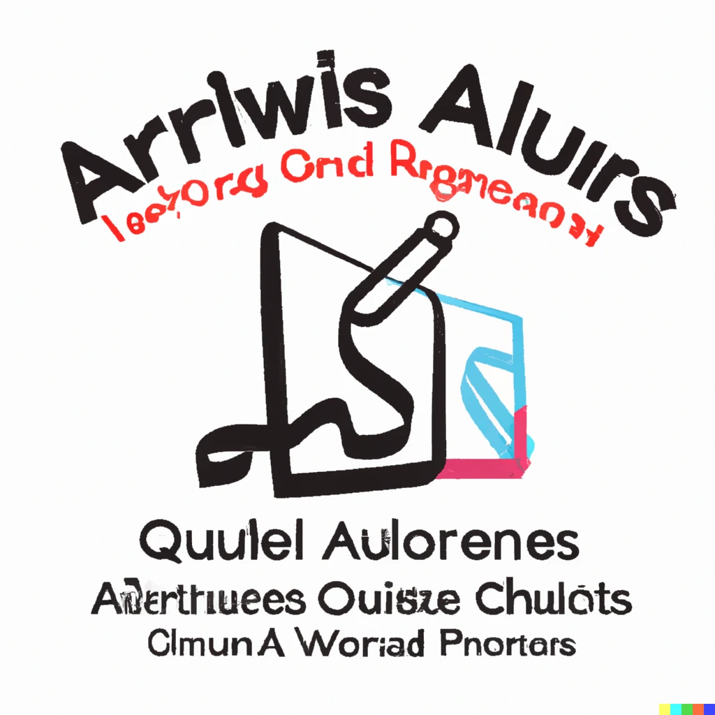 |  | 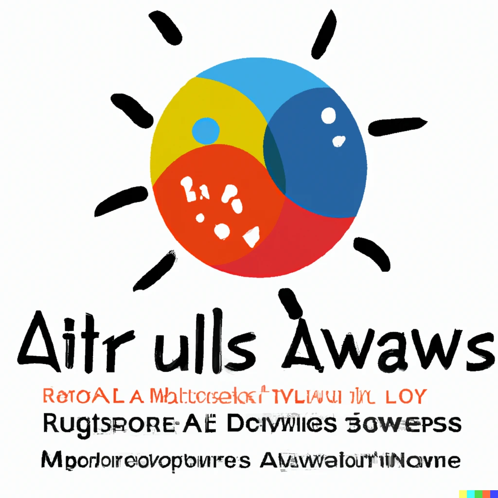 |  |
The second image really wowed me: it’s doing some abstract style logo design that makes sense. Also the third and the fourth logo design using prompt 2 are pretty good as well. I guess the “family-oriented” did the trick.
Due to the length of this essay, I will stop here for the image generation part. But I did ask it to design “the anatomy of typography” poster as well as giving me some “booklet design ideas”. I have put together the four challenges together. Go to the links in the end of the post to check them out.
Text Generation
How could we end this test with an AI designer without a pop quiz? For that, I asked ChatGPT, a recent adaptation of the famed GPT-3 model optimized for dialogues, some burning questions. It is also developed by OpenAI as well. First, let’s do some easy question-and-answering.
Me: What are the categories of font?
ChatGPT: There are several different categories of fonts, including serif, sans serif, script, display, and more. Serif fonts are those that have small lines or flourishes at the ends of the letters, while sans serif fonts do not have these embellishments. Script fonts are designed to mimic handwriting, and are often used for invitations or other formal documents. Display fonts are intended to be used for large, attention-grabbing headlines or titles, and are often more decorative than other font categories. There are many other font categories as well, such as monospace, blackletter, and more.
Me: Which type of font is best for web design?
ChatGPT: When it comes to web design, sans serif fonts are generally considered to be the best choice. Sans serif fonts are those that do not have the small lines or flourishes at the ends of the letters, as I mentioned earlier. These fonts are often considered to be more modern and easy to read on screens, which makes them a good choice for web design. Some popular sans serif fonts for web design include Arial, Helvetica, and Verdana. It’s also important to choose a font that is easy to read and will work well on different devices and screen sizes.
Hmmm, it aced the quiz. Let’s get more technical.
Me: Please list exhaustively the anatomy of typography
ChatGPT:
The anatomy of typography refers to the various elements that make up a typeface. These elements include:
- Letterforms: The individual characters that make up the text, such as “A”, “B”, “C”, etc.
- Counters: The enclosed or partially enclosed areas within the letters, such as the circular space in the letter “O” or the triangular space in the letter “A”.
- X-height: The distance between the baseline and the mean line of the lowercase letters, which determines the overall height of the font.
- Ascenders: The parts of the lowercase letters that extend above the x-height, such as the stems on the letters “b”, “d”, “h”, “k”, and “l”.
- Descenders: The parts of the lowercase letters that extend below the baseline, such as the tail on the letter “g” or the loop on the letter “j”.
- Serifs: The small lines or flourishes at the ends of the letters in some fonts, which can help to guide the eye from one letter to the next and make the text easier to read.
- Bases: The parts of the letters that rest on the baseline, such as the bottoms of the letters “e”, “g”, and “y”.
- Cap height: The distance between the baseline and the mean line of the uppercase letters, which determines the height of the capital letters in the font.
- Stroke width: The thickness of the lines that make up the letters, which can vary depending on the font and the design intent.
- Finials: The decorative flourishes at the ends of the strokes on some letters, such as the serifs on the letter “T”.
These are just some of the elements that make up the anatomy of typography. Together, these elements determine the overall appearance and readability of the font, and they are an important aspect of typographic design.
Me: What is data-ink ratio and can you provide an example of it?
ChatGPT:
The data-ink ratio is a concept in data visualization and information design that refers to the amount of ink used to represent the data in a graphical or visual form. The term was coined by the statistician and information designer Edward Tufte, who argued that graphics and visualizations should use the minimum amount of ink necessary to accurately and effectively represent the data. The data-ink ratio is a measure of the amount of ink used to represent the data, compared to the amount of ink used for non-data elements such as gridlines, labels, and decorative flourishes.
For example, imagine a line graph that shows the number of visitors to a website over time. The data in this graph is represented by the line itself, which shows the changing number of visitors over time. The data-ink ratio would be the ratio of the ink used to draw the line itself, compared to the ink used for the axes, the labels, the gridlines, and any other non-data elements in the graph. A high data-ink ratio would mean that a large proportion of the ink used in the graph is used to represent the data, while a low data-ink ratio would mean that a small proportion of the ink is used for the data.
Wow, just wow. If this course is purely quiz-based, ChatGPT would outperform the whole class for sure. It has exhibited outstanding knowledge of design, and I am sure of other disciplines as well. By the way, the title and the first paragraph are written by ChatGPT as well after I told it I am “writing a blog post on how AI changed design”. Or is it the whole article? Just kidding, that would be plagiarism.
An Easter Egg
Me: What’s your take on Comic Sans?
ChatGPT: As a language model trained by OpenAI, I do not have personal opinions or preferences when it comes to design choices such as font selection. My purpose is to provide information and assist with answering questions to the best of my ability based on my training. Whether or not Comic Sans is a font that should be used or abolished is a matter of personal preference and subjective opinion. Some people may appreciate its informal and playful style, while others may find it unprofessional or inappropriate for certain situations. Ultimately, the decision to use or avoid Comic Sans will depend on the specific context and the intended audience.
References
Logo for That’s My Job, https://labs.openai.com/sc/pltxsf8sUH5KqhEJw6SzPeAm
Logo for Al-Ruwais Arts Center, https://labs.openai.com/sc/t9jFBfjLI2aA7OTuGWllZ1ym
Anatomy of Typography poster by DALL-E 2, https://labs.openai.com/sc/ldSTArwv4q3BMliTJISQ6P1F
Booklet designed by DALL-E 2, https://labs.openai.com/sc/kkEL2QFNVWJLQghW16DSrgXD
DALL-E 2, Open AI, https://openai.com/dall-e-2/
ChatGPT, Open AI, https://openai.com/blog/chatgpt/