The Metro Maps – Navigating for All
People seems to have a thing for metro maps. I have seen many of my friends posting their comments of metro maps, some of them even designed or revamped a metro map of their hometowns. I somehow understand this sense of enchantment, imprinted in the nature of transit maps: they are closely associated with our memories in those cities and most of them see them every day when commuting. For me, it was a bit personal: the construction of metro system in my hometown Changsha began in my primary school, and the first two lines was operational during middle school. Now I am studying abroad in another country, every time I go back home, I would see new lines and stations getting added to the ever-expanding map. Therefore, I devote this post to my hometown and every metro station I have been to as a tribute.
There are a few elements that every single functional metro map should include: station indicators and names, lines and line identifiers, interchanges, and color codings (Bain 2010). But that’s boring stuff. The unique design language for a city’s transit system is manifested in its map undoubtedly. Let’s look at the famous NYC Metro, one that I love and hate deeply, and its story for helping the masses to navigate. In mid-1960s, the NYC metro system was a mess — advertising companies are commissioned to make signages in different stations and they use variable fonts, abbreviations, and even lighting for competition (McNair). The graphic design legend, Massimo Vignelli and his colleague Bob Noorda, spent hours researching how passengers look for information throughout the subway system and unified the wayfinding language for all the stations. The GIF below shows an example for subway signage.

But the map Vignelli spearheaded the trend of abstraction in metro maps. See the portion of the metro map below, we could see that he removed the geographical shapes of Manhattan completely and used smooth, round curves for lines, which is in no way a faithful depiction of the actual lines. It turns out such design worked badly in New York, whose streets are named by numbers abominably. The lack of lardmarks and geographical features made people hard to locate where they are and the destination quickly. However, the notion of simplifying lines for the pleasure of eyes stayed to this day. The technique of only apply a limited number of angles to lines — which was pioneered by Harry Beck, the designer for London Underground map – was also adopted by Vignelli and remained a consensus for metro map design (Bain 2010; Glantz). These practices are what made metro maps both aesthetically pleasant and functionally useful to look at.

There are also few lessons to be learned from the New Paris Metro Map, see the image below. Some distinctive visual features that stood out was the highly-regular circular lines around the city center. Also, it uses famous landmarks, like Louvre, Notre Dame, and Disneyland to help tourists nagivate the map quickly without having to search thorugh the station names. However, it took many many iterations to get the map to such state, see the video below of how the New Paris Metro Map evolved from a blank sheet to this joy for eyes.
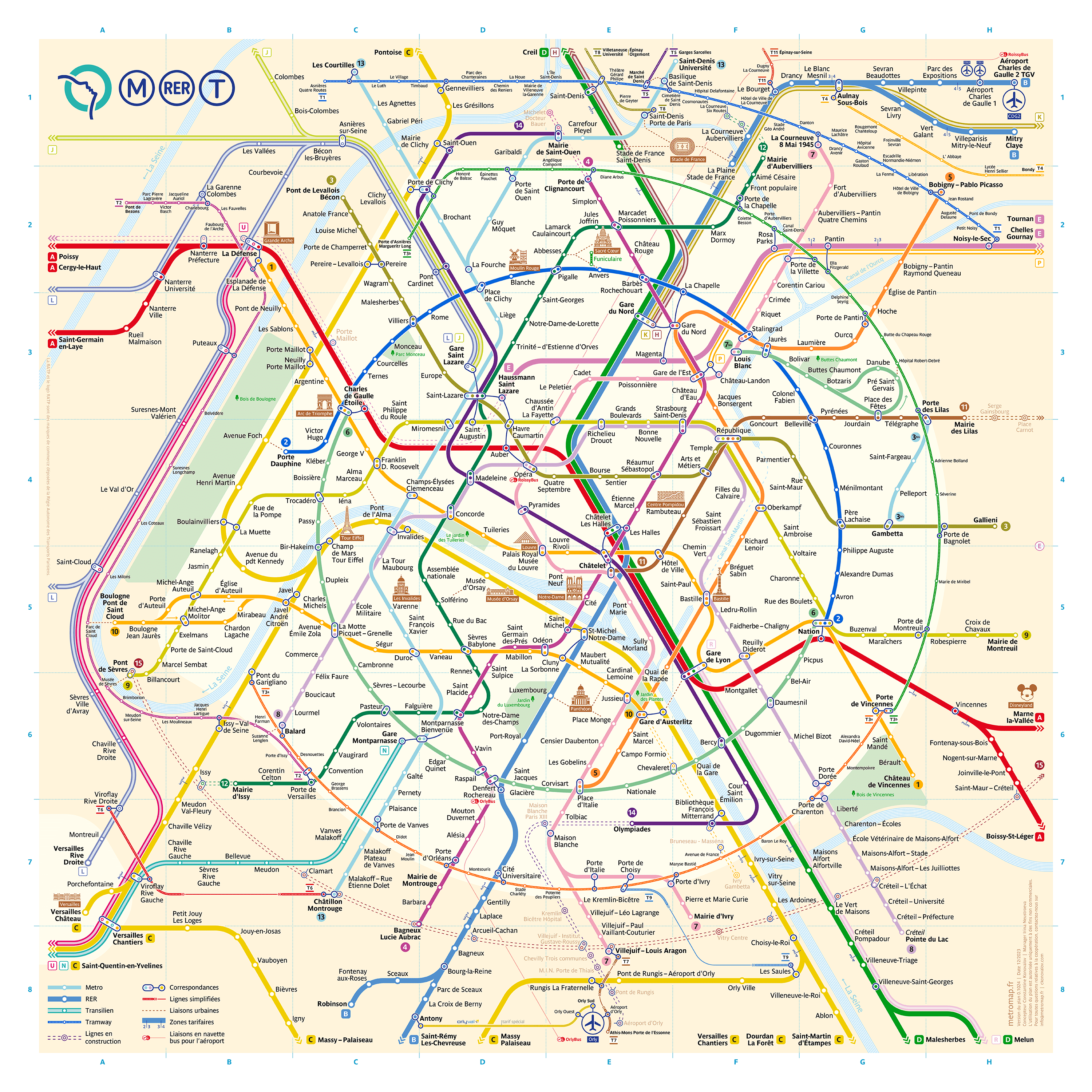
Development of the Paris metro map from Constantine Konovalov on Vimeo.
References
Bain, Peter, Parsons Journal For Information Mapping, “Aspects of Transit Map Design”, 2010, pp. 1-6.
Glantz, Keith, Glantz Design, “The World’s Best Designed Metro Maps”. https://glantz.net/blog/the-worlds-best-designed-metro-maps/
Jeremiah McNair, Simon Martin, Ceros, How Graphic Design Legend Massimo Vignelli Cracked the NYC Subway System. https://www.ceros.com/inspire/originals/massimo-vignelli-nyc-subway/
More Interesting Sources to Look At
The New Paris Metro Map, https://metromap.fr/en
Overview of the World’s Metro Maps, https://99designs.com/blog/creative-inspiration/the-worlds-subway-maps/
Last but not least, a fun game called Mini Metro, where you connect stations to accomodate the passengers, the game’s lines are extremely pleasing to look at.