An Overview of Chinese Typefaces
Chinese typeface is a hodgepodge of elegance, complexity, and history. Because of the extensive cultural exchanges that started as early as the second century, Chinese—which is arguably the oldest writing system still in use—was used not just in mainland China but also in Taiwan, Japan, and Korea [@roy1967]. While the intriguing history of how each state adopted and then deprecated/evolved the use of Chinese characters is for another day, this blog aims to explore the anatomy of Chinese characters and how they are designed.
The Complex Genealogy of Chinese
Chinese is a logographic language, meaning that a single written character represents a whole word, which is different from Arabic and Hebrew, which are Abjad, and Latin, which is alphabetical [@daniels1996]. Chinese is therefore thought to have more than 100 thousand characters, yet a normal educated person would only be familiar with about 3000 of them [@norman1988].
The modern (and often digital) Chinese typefaces stemmed from the traditional Chinese calligraphy. The artwork below, created by Archer Zuo and printed using letterpress, illustrates the historical development of Chinese characters.

The image above demonstrates the evolution of script styles from highly pictographic and complex inscriptions to more abstract and concise clerical and regular scripts. These days, the most widely used typefaces in digital media are Gothic/Sans-Serif (#28), Ming (also known as SimSun #27), and Regular Script (#14). The complexity does not end there, a fter the PRC was established, Simplified Chinese was introduced in an effort to raise literacy rates. This means that each character must be created twice for each particular typeface. Such arduous undertaking is one of the main reasons fonts are typically monopolized by companies and there are few resources online about the intricacies of type design.
The Anatomy of Chinese Characters
As Latin-scripts have baseline, x-height, and ascenders/descenders, I try to identify comparable design elements in the design of Chinese characters.
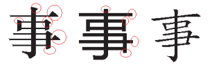
According to Liang’s response to the question “Do Chinese fonts have Baseline?,” unlike the fixed baseline in alphabets, a baseline in Chinese might be derived that is slightly above the lower edge. The “reference” baseline, shown in red in the graphic below, is frequently used to align Chinese and English in contexts with mixed-language speakers [@liang2013].
For other concepts such as serifs, x-height, and ascenders/descenders, I found an interesting chapter on the analysis of those elements in other languages, coincidentally by several fellow computer scientists. While drawing parallels with English, they employed pattern recognition techniques to examine numerous Chinese fonts. They came to the conclusion that x-height, ascenders, and descenders do not apply to Chinese because characters are quite varied, in addition to verifying baseline is more of a reference in Chinese fonts. Chinese does, however, share several ideas with English, including as serifs, the weight formula, and stem designs (for some characters). From left to right, the image below displays three characters in the Serif, Sans-Serif, and original typefaces [@suen2017].
There is so much more to Chinese typefaces as there are many intriguing stories behind some of the most famous font families in Chinese. Hopefully, I could dive into a specific font family in the following blogs.
Bibliography
While doing the research for this blog, I encountered many initiatives/designs/resources that are far more knowledgeable and accurate with regards to Chinese typefaces and its evolution. I list them here as an extension of this blog.
English
The Complete Beginner’s Guide to Chinese Fonts by Kendra Schaefer, an ex-designer based in Beijing
Liang Hai, he helps Unicode and OpenType understands complex scripts like Indic ones and Mongolian
Chinese
JustFont, a font design company that offers educational initiatives, and they publish the story behind type design on their blog
The History of Chinese Scripts by Yoshikazu Imada, published on TheType, an independent initiative on font design, graphic design, technology, and visual culture.